Warehouseline
Market review, branding and website concept.
The idea for the project was to create a website that will stand out in the warehouse industry thanks to its transparency and interesting aesthetics. The user was to easily find the content he was interested in, regardless of the level of ability to use the Internet offer. The most important features that I focused on while designing are: intuitive navigation as well as friendly and light design.
Services provided:
Visual concept
Wireframes and prototypes
Branding, UI & Graphic Design
Results and outcome:
Branding
Website UI and graphic design
Animations and micro-interactions
Process:
Analysis
Understanding the problem
Early concepts
Solution
Problem
Preliminary analysis of various websites in the warehouse space rental market has revealed a significant issue: visual and informational chaos. These sites often replicate mistakes associated with cramming too much information into limited space, lacking adequate white space, which substantially hampers readability and information absorption.
Aggressive color schemes are overused, there's a clear absence of proper hierarchy in the importance of elements, and issues with contrast and visibility of certain information are prevalent. Additionally, navigation is often unclear, further complicating the user experience.
Goal
The primary goal of this project was to create a user-centric design for a warehouse space rental website, focusing on clarity, usability, and a streamlined information presentation. By consciously avoiding the common pitfalls of visual and informational overload, i aimed to ensure that users could easily navigate the site, find the information they need without feeling overwhelmed, and make informed decisions.
Emphasis was placed on utilizing a harmonious color palette, establishing a clear hierarchy of information, and incorporating ample white space to enhance readability and user engagement.

Mind map
Overview
-
LF wireframes

-
White spaces play a large role in the design. Properly used and managed, it has a very positive effect on legibility and aesthetics.

-

-

-
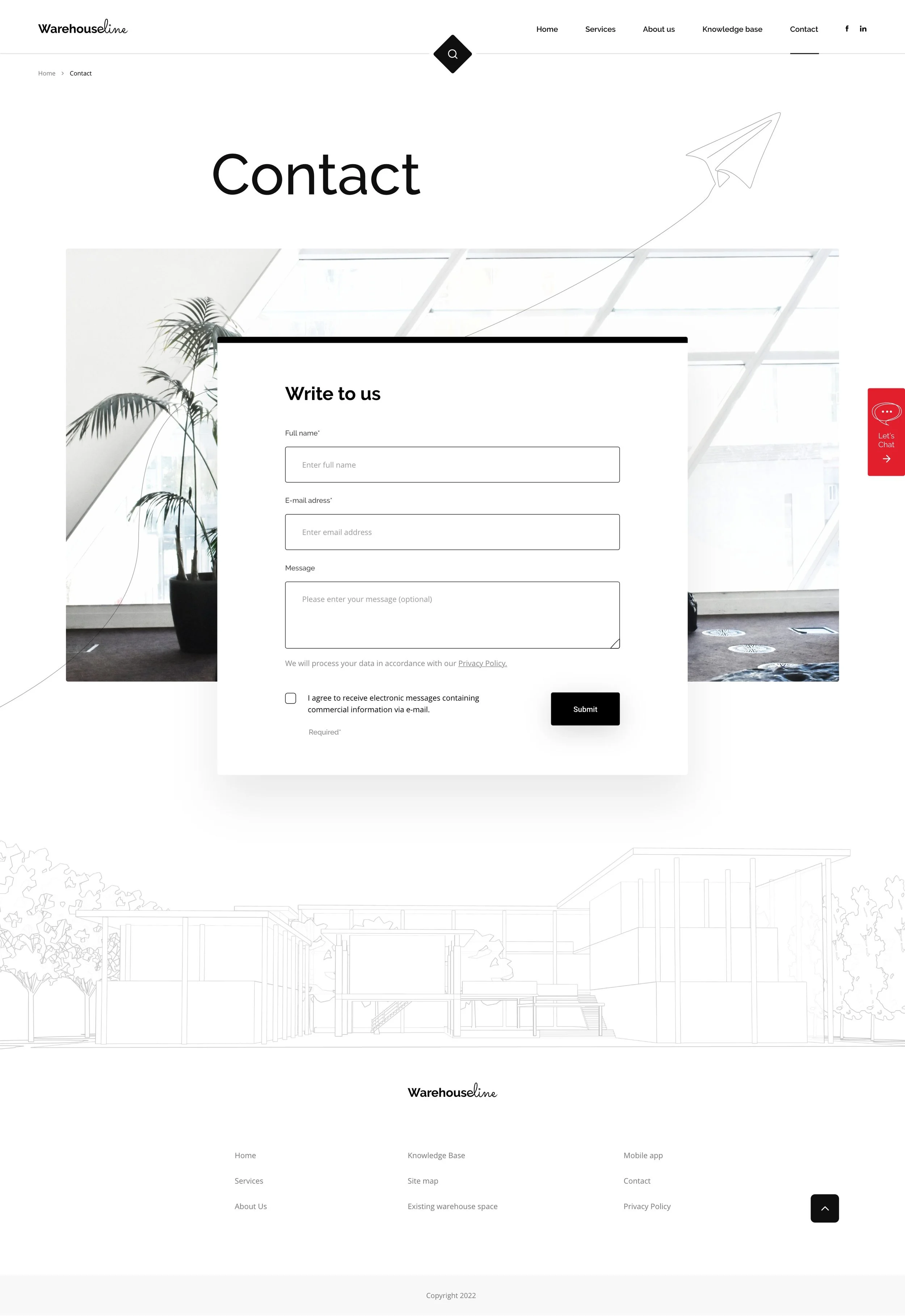
In addition to the contact details at the bottom of the subpages, a standard application form is available
-
-
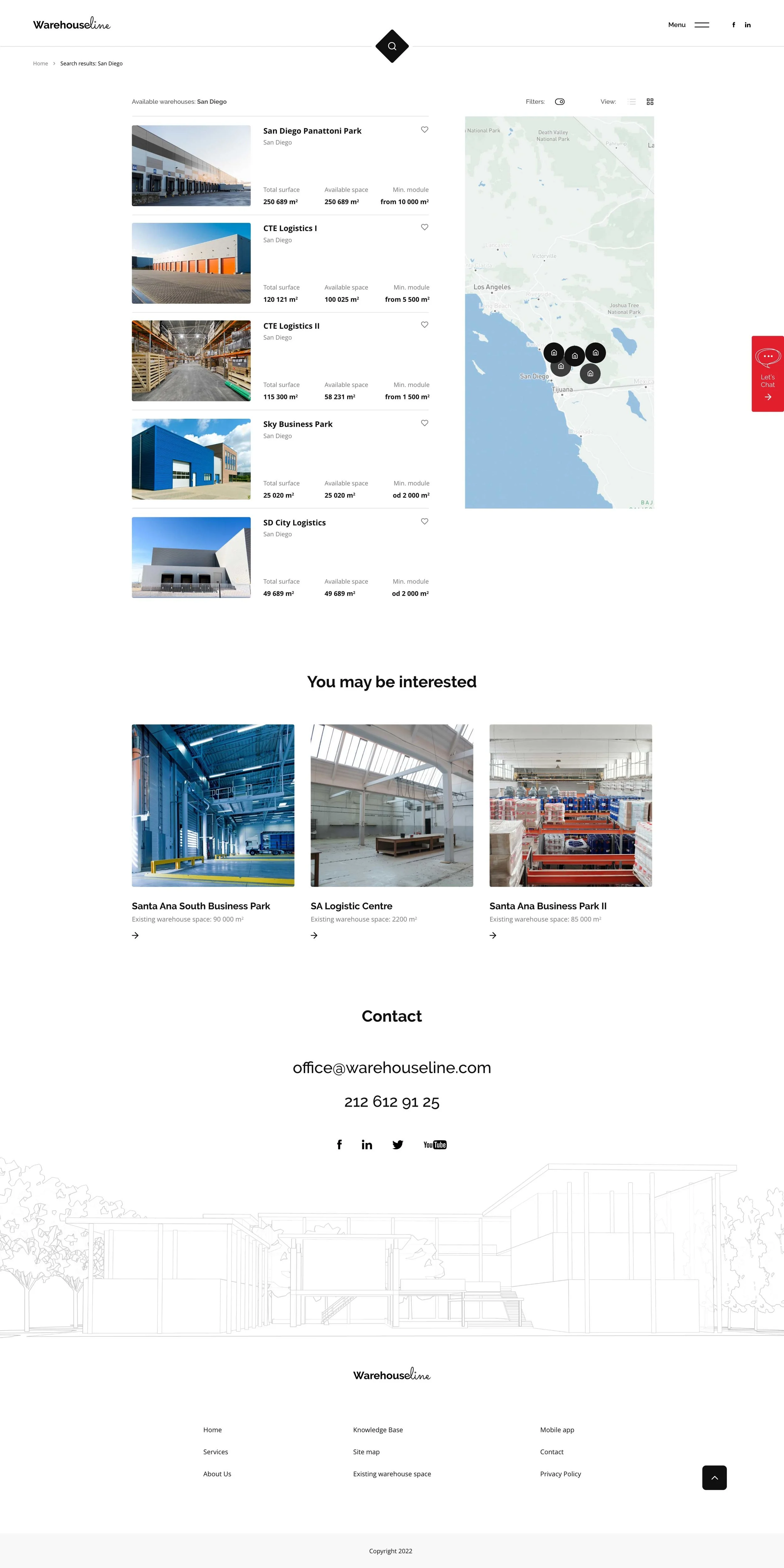
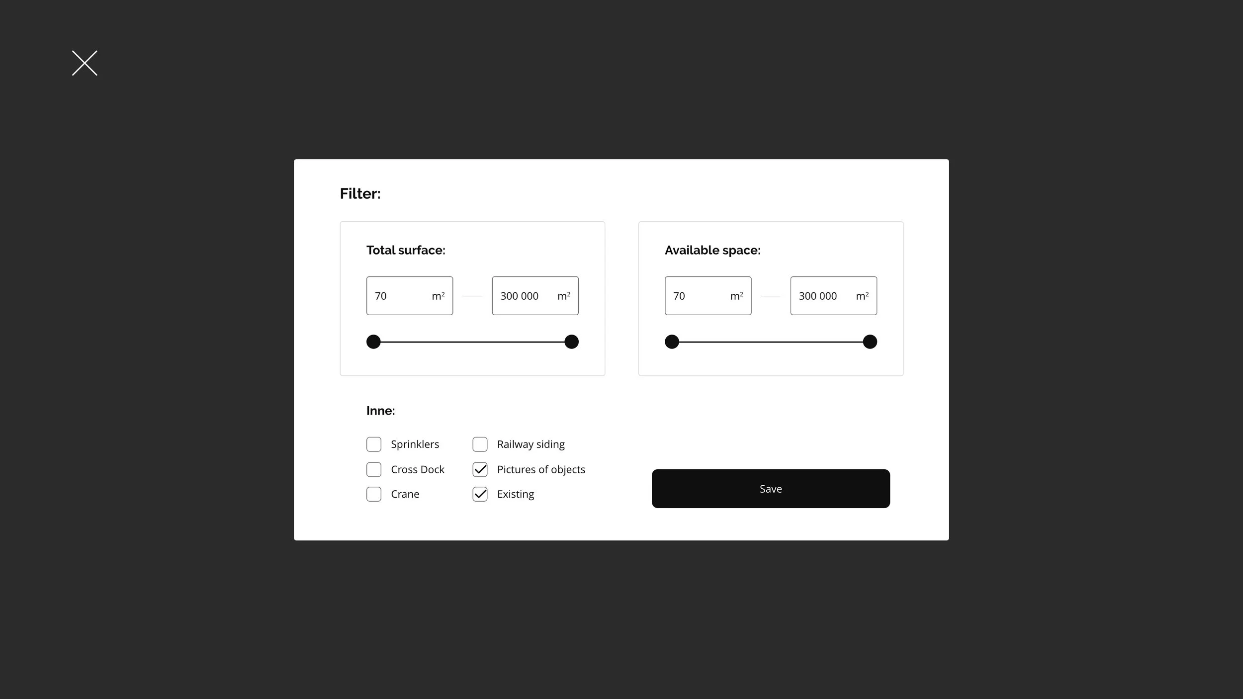
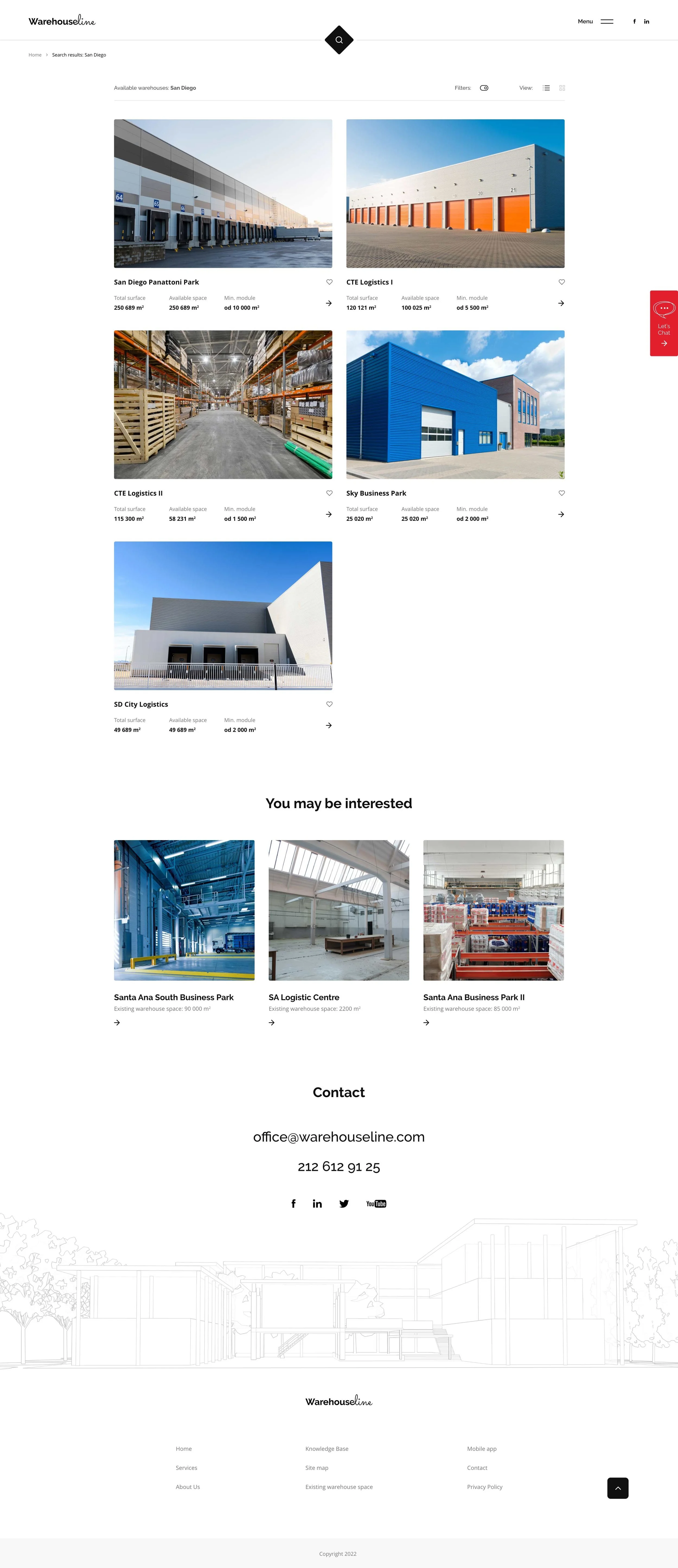
Extended filters to choose from, and 2 standard views of search results. Simple and clear map in list view.
