VOLVO
Revamping templates and graphics to enhance user experiences.
I tackled the challenge of improving Volvo internal materials, which suffered from poor readability, aesthetics, and information overload. My role involved analyzing existing resources, identifying key UX issues, and designing new, more intuitive layouts for intranet pages and presentations.
The goal was not only to introduce a clear information hierarchy but also to ensure visual appeal. The outcome was a significant enhancement of internal communication, boosting efficiency and employee satisfaction.
Services provided:
UX/UI audit of internal assets
Pinpointing critical usability flaws
Architecting intuitive intranet and presentation designs
Streamlining information architecture for clarity
Elevating visual design for engagement
Optimizing communications for operational efficiency
Results and outcome:
Elevated user engagement and satisfaction
Streamlined access to information
Improved internal communication efficiency
Enhanced aesthetic appeal of digital assets
Increased operational productivity
Positive feedback from internal stakeholder
Process:
Understanding the context and the problem
Analysis of feedback, Pain Points and needs
Defining the goal
Solution
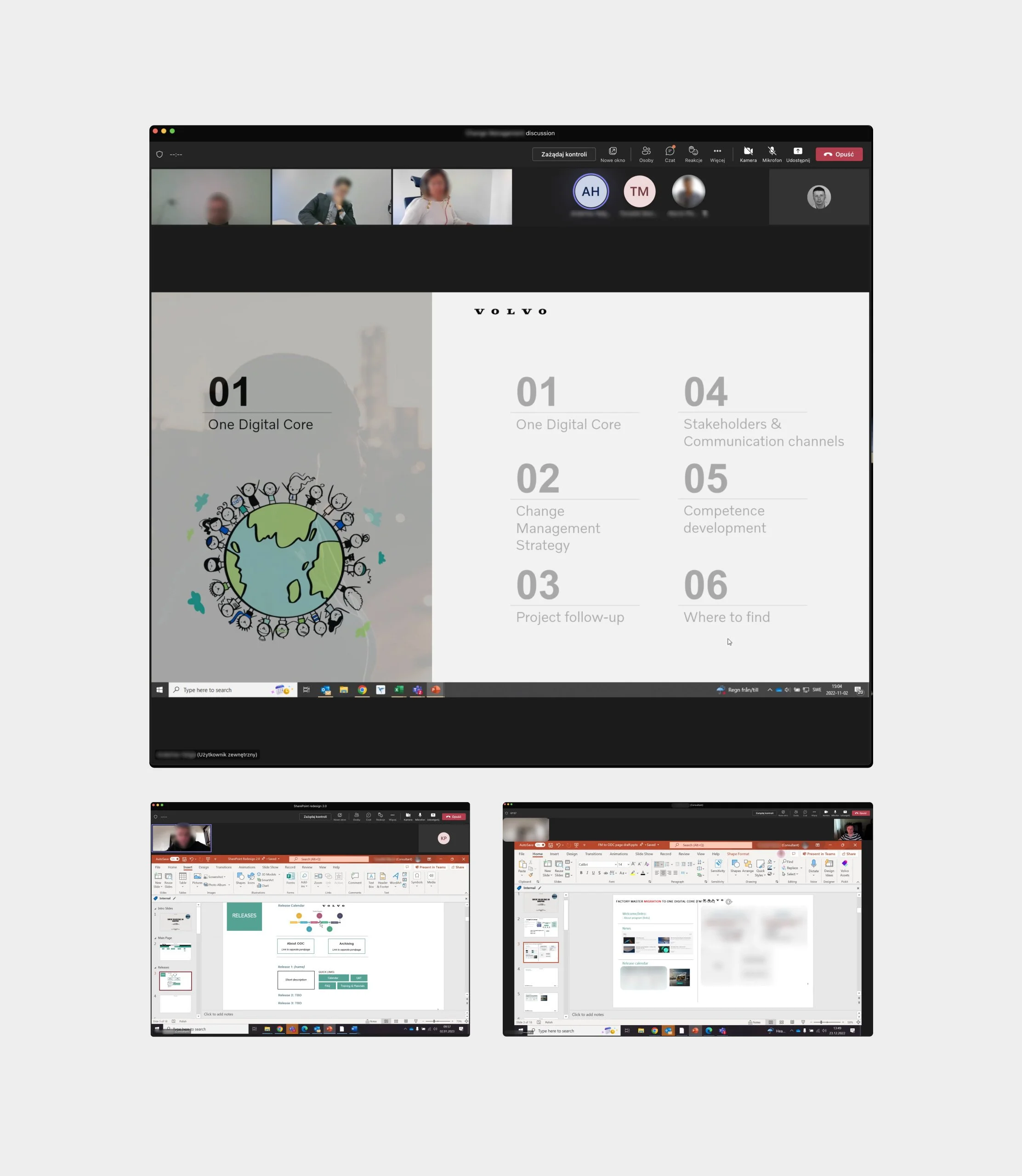
Old templates and materials.

Context and Problem
In a large, globally dispersed corporation, an ambitious internal ODC (One Digital Core) project was launched, relying on efficient communication between international teams.
Tasked with sharing crucial knowledge and information, they faced significant barriers due to unoptimized tools and materials, leading to confusion, delays, and increased misunderstanding risks, hindering the project's efficiency and progress.
The absence of unified principles emerged as the primary conclusion from the detailed analysis. This lack of standardization led to low readability, as pages were overcrowded with data, resulting in insufficient space and making content scanning difficult. Ineffective use of white space and poorly chosen font sizes created visual hierarchy chaos.
Moreover, poor quality and overly complex graphics further degraded aesthetics and clarity, exacerbating the issues stemming from the absence of common guidelines for creating and utilizing materials.

Analysis
To develop a new solution for One Digital Core, a comprehensive analytical approach was essential. This approach not only identified areas needing improvement but also provided insights into best practices and user expectations. Below are the three main analytical methods I employed:
Team Member Feedback Sessions - I began by conducting detailed discussions with team members. Direct communication with those involved in daily operations allowed me to gather valuable feedback on current processes and materials, laying the foundation for further analysis.
Usability Audit of One Digital Core (ODC) Materials - Next, I performed a usability audit of existing ODC materials. This evaluation from an end-user perspective helped identify usability barriers and potential areas for innovation and optimization. It was crucial for understanding how ODC materials support users' daily work and how they could be improved.
SharePoint Internal Pages Analysis for CMS Optimization - Finally, I thoroughly examined SharePoint internal pages. Understanding SharePoint's capabilities allowed me to maximize the platform's use for ODC pages, analyzing data structures, templates, and integration possibilities. This analysis aided in designing a solution that is not only intuitive for users but also flexible and scalable.
Each method contributed significantly to the design process, enabling me to create a solution that meets current needs while being adaptable for future challenges.
Solution
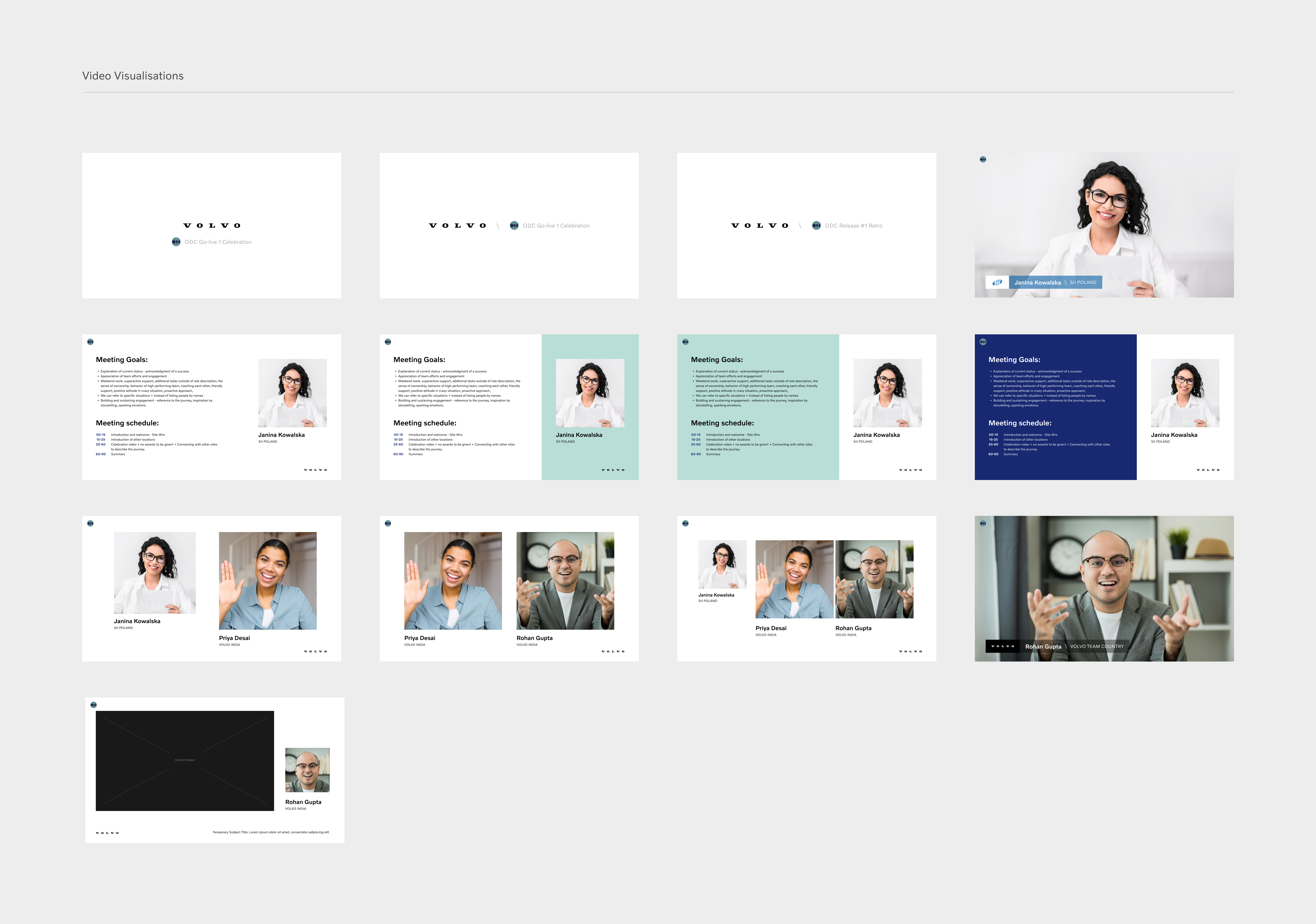
The analysis led to the creation of a comprehensive solution: a set of guidelines for material creation, optimization, and redesign of existing resources. Recognizing the challenges posed by the absence of unified principles, this new framework aimed to standardize the production and use of materials, ensuring clarity, readability, and efficient communication.
All personal data and some of the information have been changed.

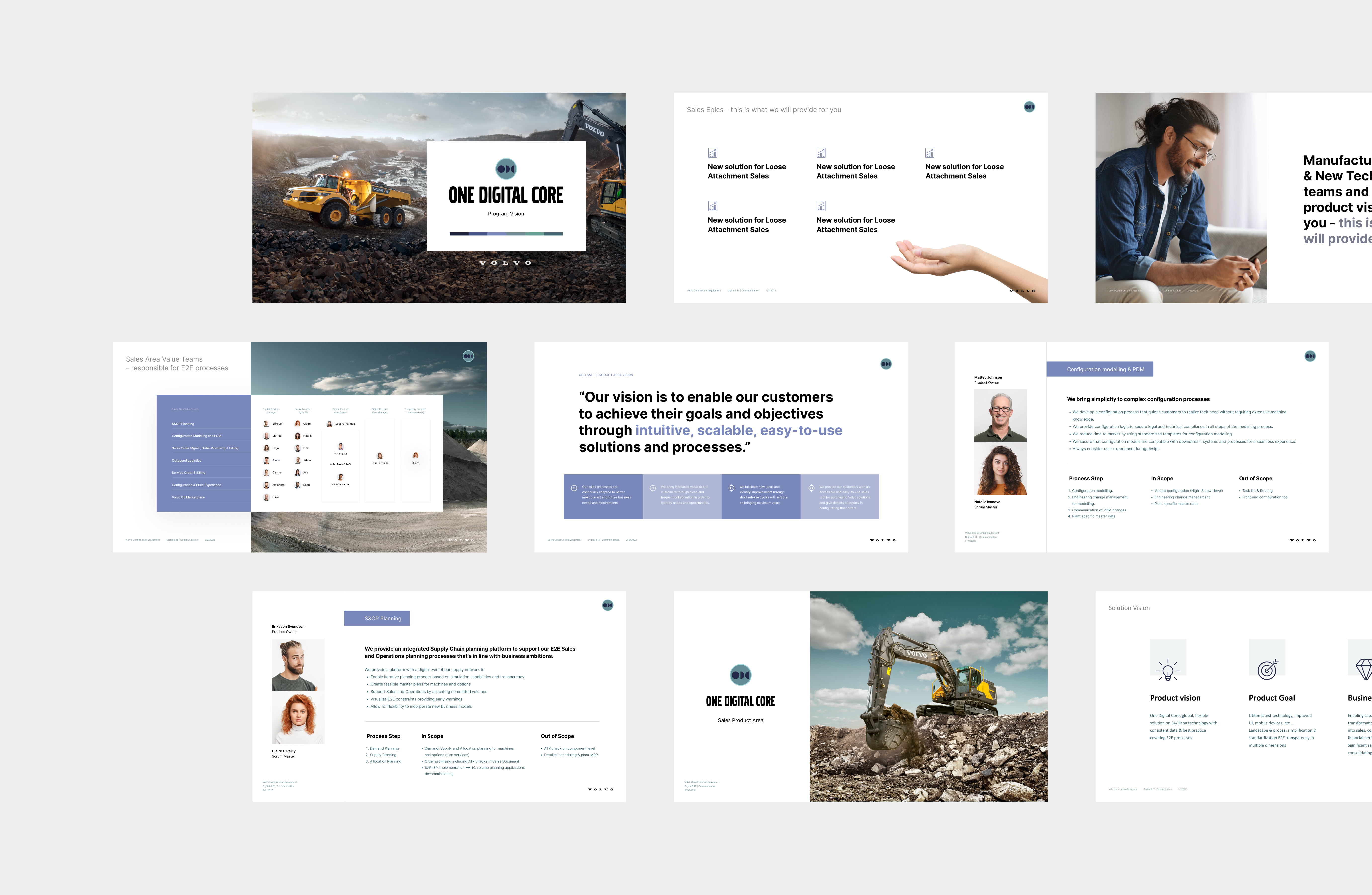
It focused on rationalizing the use of white space, selecting appropriate font sizes to establish a clear visual hierarchy, and simplifying graphics to enhance aesthetics and understanding.
All personal data and some of the information have been changed.

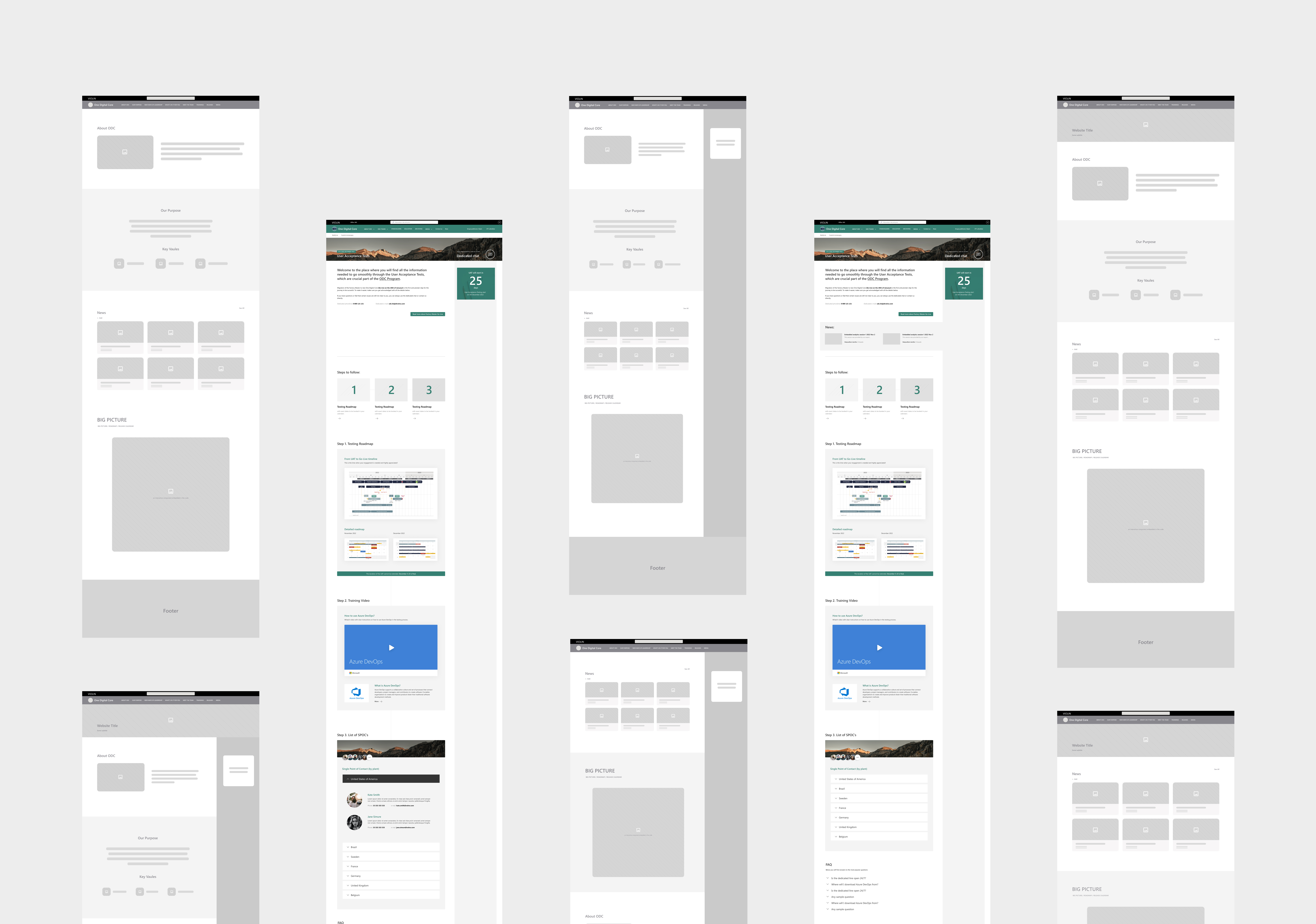
This strategic approach not only addressed the immediate issues but also laid the groundwork for consistent, high-quality material development moving forward.
All personal data and some of the information have been changed.


